The AI tutor that refuses to answer.
What happens when you build a civic-reasoning app whose only rule is: no shortcuts? After three weeks with a prototype called WHEREFORE, a few notes on friction, hint economies, and why we made the mascot stubborn on purpose.
The conversation that started this project went like this. A high-school civics teacher I know was grading a stack of essays on the First Amendment. About a third of them, she said, had the same odd cadence — the same three rhetorical moves, the same hedged phrasing, the same conclusion arrived at suspiciously quickly. "They're not even hiding it anymore," she said. "But I don't think they understand what they turned in. They didn't reason about anything."
That's the puzzle. The model in their pocket can produce a passable essay on the heckler's veto in eleven seconds. So the question stopped being "how do we teach the doctrine" and started being "how do we teach the move — the cognitive act of working a hard question — when the temptation to skip it is one tab away?"
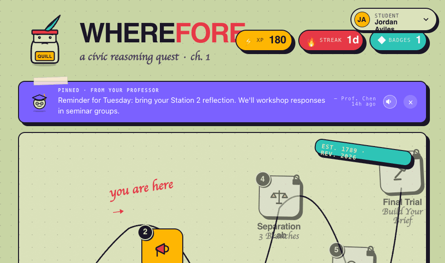
WHEREFORE is one answer. It is a small, single-station civic-reasoning prototype, built around a mascot named Quill whose defining feature is that he will not tell you the answer. Not when you ask politely. Not when you ask three times. Not when you tell him you're stuck. He'll ask better questions. He'll redirect. He'll, occasionally, get sassy. He will not give you the answer.
"If you can't name the question, you can't answer it."
§ 01The pedagogy, plain
Three principles run on a thin band across the top of every screen. They are also the entire design philosophy of the app, compressed:
No answers.
Quill won't ever just tell you. Hints unlock only when you've genuinely tried.
Show your reasoning.
Every phase asks for written thinking before you advance. Receipts required.
Stuck = good.
Friction is the point. The hard parts are where learning lives.
Pedagogy people will recognize this as roughly the territory of productive struggle — the well-documented finding that learners retain more when they wrestle with a problem before being shown a solution. The version we built is opinionated. We don't just permit struggle, we require it ↓ design the interface so that you can't get past it without producing evidence of having done it.
§ 02The shape of one station
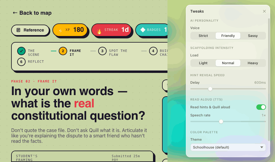
The prototype contains a single playable station, "The Heckler's Veto." It's a five-phase walk through one fact pattern: a state university cancels a controversial speaker's event after a hostile counter-protest arrives. The student is asked, in order, to:
Read the facts. Then frame the constitutional question in their own words. Then pick the soundest of three classmates' arguments and explain why. Then assemble a three-step reasoning chain from a bank of six premises — half of which are traps. Then defend their position when Quill switches sides and plays opposing counsel. Then, finally, write a reflection: where else does this pattern show up?
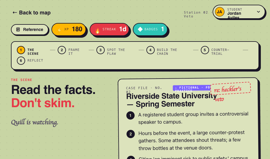
Each of those is a written-input gate. You cannot click past any phase without leaving a trail.
§ 03Hints as economy, not service
The most-tested mechanic in the build is the "I'm stuck" button. It does three things, and the design of those three things took longer than the rest of the app combined.
First, pressing it is logged. The teacher sees a per-phase count of how many times the student asked for help. It's not a punishment; it's information. Second, the next hint doesn't arrive instantly — there's a configurable delay, usually around six hundred milliseconds, long enough for the student to feel that the system is thinking, not vending. Third, hints arrive in tiers. The first hint is a question. The second is a narrower question. The third is a domain term you can search. None of them is the answer.
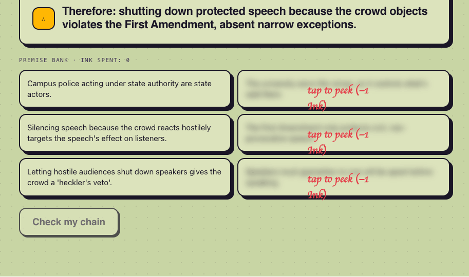
Phase 04 takes this further. The premise bank is half-blurred — the trap premises are censored under a frosted overlay, and tapping one to reveal it costs an "Ink," a soft currency tracked at the bottom of the screen. We tried versions where the cost was a flat XP penalty, a streak break, and a visible-to-teacher flag. The Ink version tested best: it felt costly enough to slow people down without feeling punitive. The point isn't to prevent peeking. The point is to make peeking visible — to yourself, and to your teacher.
"Don't measure how often students get the right answer. Measure how often they show their work."
§ 04The two-person room
The other half of the design assumption is that the teacher is in the room. Not as a grader at the end, but as a reader along the way. Every text the student writes is captured. The teacher has a toggle in the top-right that flips the same URL from a student view (write boxes) to a teacher view (the student's submitted text, plus a small editor to leave a note).
Notes carry one of three tags: PRAISE, FLAG, or REVISE. We tried more granular tagging (effort, accuracy, clarity, etc.) and it died on contact with actual teachers. Three was the right number. Praise should name the cognitive move, not just say "good job." A flag is an open question for next class. A revise gives the student a specific target. The interface enforces a little of this with quick-start templates ("Praise should name the move you'd want them to repeat…"); the rest is left to the teacher.
There's also a class-wide pin — one short message that sits as a sticky-tape note over every student's quest map. It's the most-used feature in our test sessions. Teachers reach for it constantly: "bring your reflection Tuesday," "office hours moved," "today's seminar is in Room 204." The mundane, but the mundane is the texture of an actual class.
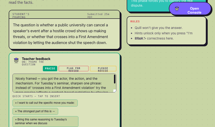
In testing, teachers used the editor more carefully when it forced them to pick a stance. With no tag, every note drifted toward "this is fine" — the path of least resistance. With one tag required, notes got specific. PRAISE made teachers name a concrete move; FLAG read as "let's discuss," not "wrong," which preserved student agency; REVISE was the rarest, and the most valuable. It almost always came with a sentence-level edit suggestion.
§ 05What it looks like, and why
The visual language is — deliberately — not a corporate ed-tech tool. It is the inside of a worn paperback: stamped cards, hard-edge drop shadows, a sage background under a dotted grid, a hand-lettered display face. There is a mascot with a feather plume. There is, briefly, confetti.
Some of this is taste. More of it is research. The product is asking students to do something hard and uncomfortable — sit with a question they cannot resolve. Every visual decision is built around lowering the temperature on that ask. The colors are warm. The buttons are big. Quill blinks at you and has moods. There is a "stuck meter" that fills up when you struggle, and on completion turns green — a small dignity granted to the process of being stuck.
The opposite design — cool palette, clinical type, big assessment language — is what most learning software looks like, and it is what students associate with the feeling of being graded. We didn't want to grade. We wanted to read.
§ 06What this isn't
It is one station. It is a prototype. Five more stops on the quest map — Federalism Forge, Separation Lab, Due Process Detective, the Final Trial — are visible but locked. Quill is not, today, a real language model. The Socratic replies are pattern-matched against the student's text, picking from a small library of persona-shaped responses. We did this on purpose: a model that can — under enough pressure — cave and give the answer is the wrong tool for this lesson. A pattern-matcher that cannot cave is, for now, the right one.
That will change. The interesting next step is plugging in a real model with a hard system prompt and a tested refusal behavior. The harder, more interesting question is what happens when a student spends fifteen minutes trying to jailbreak Quill into giving them the answer. Our working theory: that fifteen minutes might be the most productive learning of the session. We'll see.
§ 07A small wager
The big bet behind WHEREFORE is unfashionable: that the value of an educational tool, in 2026, is not its ability to be helpful but its ability to be well-shaped resistance. A good tutor is not the one who answers your question fastest. A good tutor is the one who asks you the question that gets you to the answer, holds the line when you'd rather they didn't, and reads what you actually wrote.
Quill is not a tutor in any rigorous sense. He's a UI with an attitude. But the attitude — "I won't tell you, but I'll ask you the question that gets you there" — is, we think, the only honest posture for an AI in a classroom right now. Everything else trains a habit nobody wants: the habit of asking a machine to think for you.
The mascot, by the way, is named after a feather. The kind you'd use to write something down before computers told you what to think.